You may not know this, but 400,000 young people of voting age did not vote in the 2013 federal election. When asked by older people about youth attitudes towards politics, I listed off a lot of factors, but I think it is mainly about these three things: Authority, sincerity and language, which flow into each other.
Today's youth are even more inundated with information, and become ever better at subconsciously decoding semiotic messages, which leads to either hyper-cynicism of all messages, or withdrawal from them. As we become more connected, that path of cynicism leaves us wanting authentic connection — see Taylor Swift.
The other path, which often follows on from periods of striving for "authenticity" is that we become overwhelmed by the millions of opinions and deeply held views proven by polarising one-liners. It becomes harder to feel conviction, so people abstain from choice. Concurrently with our desire for authenticity, we are forced by time and number of messages to judge superficially based on semiotically intuited messages rather than spoken. We're trained so well in this that to us, politicians say so much more with tone and mannerism than they do with actual words. Language is visual, spoken, written, implied but is rarely straightforward, and unless we get really into English at school or take up an arts/culture degree it's unlikely we'll ever understand our own method of understanding.

This naturally leads to a lack of empathy for communicators in positions of authority. We're so used to image crafting, understanding the messages implicit in everything and reading cultural cues that we can't understand not having this ability. Our politicians, particularly Abbott and Pyne, struggle so badly with communication and as we get better at decoding language we lose empathy for those who can't encode it properly.
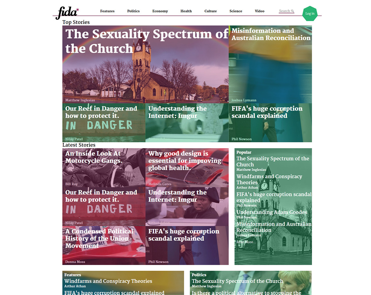
From this I see two main areas that need improvement. Firstly in the way politicians talk, as discussed above. The second is the way the media explains things, and this is an area where I feel like communication design can really help. I've been really inspired by the work of Vox media in the US and the way they cover news. Their news site Vox.com is really good at engaging young people through a few means. They way they explain politics is nearly always through the lens of culture, which is really where young people get on board. The most popular sites with youth always revolve around culture, whereas Aussie mainstream news sites view things through the lenses of business and objectivity, which is exactly where youth get off. Additionally, we can all agree that Fairfax media has ridiculously atrocious websites, whereas Vox pays attention to the latest trends in web design and uses a variety of different methods from within their site to explain different things in different ways using maps, card stacks, motion graphics, lists and great writing to really engage a younger audience. I believe a digital-first news site without clear left or right bias could make a real difference to young people in an age where everything is so polarised. A site that covers the good and bad of both sides of politics, with a focus on explaining the implications and facts of policy. This was the vision I had when I went into Identity design class last semester. So I decided to push my passion and create an identity for a news site.
I felt it was really key to consider both our indigenous and colonial cultural fabric in my design, and to appeal to youth while remaining classy. For this reason I chose to use the seven-pointed star from the current Australian flag as one of my motifs, as although the flag is complex in its symbolism, the star ultimately refers to Australia positively.
Along with the obvious connotations of statehood, the number seven is significant in one of the most well-known song-lines among indigenous Australians, the Seven Sisters, although there are many variations on it. In the story the sisters eventually become the Pleiades star cluster, and so it seemed a fitting nod to both cultures. Additionally I chose a rich pink as a colour in-between colonial blues and the rich red of the land.

The rest of the design was born from this symbol, with the heptagon alternating well in pattern with the star. 
The logotype was then drawn at an angle to fit with the points of the star, allowing them to interlock. ![]()
Each of these elements was incorporated into an overall identity design including official stationery, motion graphic stings as above and overlays for videos and a rough website design mockup.