As part of my course, we were encouraged by John Warwicker to do a series of experimental projects in some way exploring type and/or poster design. One of the examples shown in class was All The World's A Page which takes the words of a whole book and deposits them on a single page, enabling you to have an illegible copy of classic works such as Das Kapital or Pride and Prejudice on your wall so you can subtly display your cultured ways. As you can probably tell, I found the whole notion rather silly and decided to have my own go at representing an entire work on a page in an equally illegible manner. Thus without further ado about nothing, I present The Hobbit.
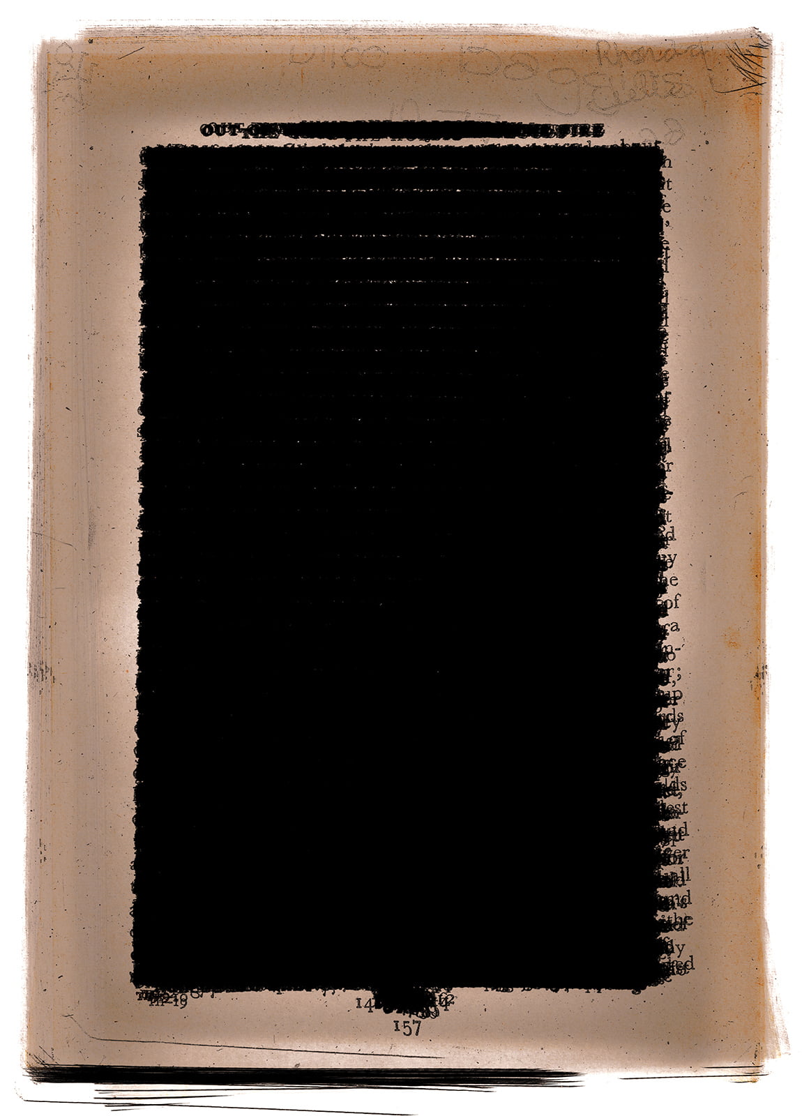
This was an interesting process. I chose to find physical versions of both texts in opp shops for economy's sake and then proceeded to slice off their spines. My mother tells me that The Hobbit was a school text when she went to high school, and the edition I found seems to be from that era, containing many scrawled notes. I then scanned each page individually on both sides at the highest resolution I could and painstakingly aligned and overlaid them in order. Some random crinkles led to the slight misalignments you can see in the resulting wall of text.
Next came Pride and Prejudice, which was made even more interesting by the difficulties I had in scanning it. For this text I decided to try using the auto-document-feeder tray, which immediately crinkled and tore the edition's preface. I then opted to feed in only ten pages at a time, but due to some errors on the scanner's part, this gave the beautiful digital artifacts you see represented below.

I never managed to get any feedback from Mr. Warwicker regarding the project as he suddenly left for Japan in the midst of submissions. I would have been very interested to see what he thought.
After I had completed the two posters, there were a lot of pages of classic texts in my room, and with these I hope to create a series of origami-inspired projects.