Philosophy
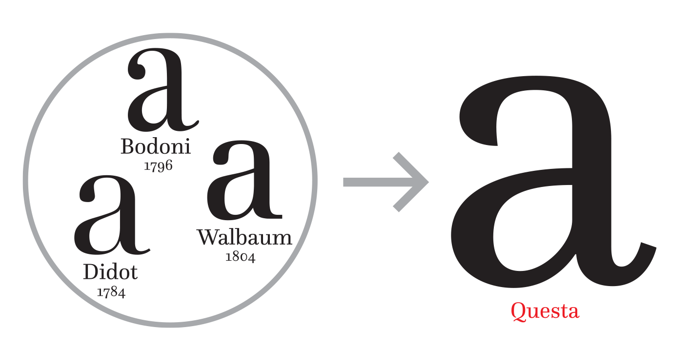
Even before the conception of this typeface, I knew I wanted a specific design philosophy for it. I was quite impressed with the Questa project by Martin Majoor and Jos Buivenga (exljbris), due to the way they went about designing the super-family. Drawing a type family by starting with a sans-serif can be problematic for two main reasons. If the letter shapes are initially designed as a sans, letterforms are generally drawn without contrast, which means adapting it to a serif can result in a totally different feel. Secondly, as sans-serif faces do not have their own italic forms, the italic sans is often essentially an optimised oblique, and must use greater angle to distinguish itself from its upright equivalent. Having said that, there are some problems with this approach, as a serif face somewhat obscures any problems with the shapes themselves, and this core geometry is most of the strength of a typeface. As this is my first real typeface, I knew I did not have the type chops to create a strong serif on my own, and yet I still wanted both original and strong forms and so I chose to reference an existing serif face in the creation of my sans. This meant I could also study the forms of serif faces while “playing it safe” with a sans.
In addition, I felt that a black weight was an excellent starting point, as this meant I would have to address problems of tightness, lack of manoeuvrability and contrast earlier on in the process, rather than hacking at it later on.
Questa drew on Bodoni, Didot and Walbaum from the 18th century to inspire the forms of their serif, and I have always loved the letterforms of these type masters. However, my favourite typefaces are even earlier, in the humanist forms of Nicolas Jenson. A humanist sans is not a new idea - you need only look around for a little while anywhere before spotting Erik Spiekermann’s Meta or one of its derivatives. Spiekermann’s Meta is truly fantastic, and really captures the humanist philosophy while borrowing some ideas from the actual letterforms. Where I hoped to differ was in more closely matching the original humanist letterforms, rather than their philosophy. This included contrast, which is often avoided in sans faces due to its apparent irrationality.
The Beginning.
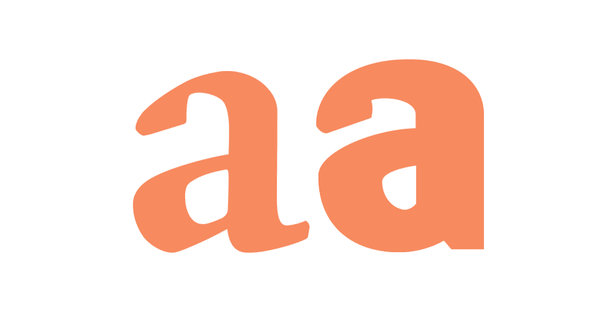
The first letters I drew were the lowercase f and j. The strong angles in the beaks of these letters differ substantially from almost every sans-serif face I know, and really set the character for the rest of the typeface. While many rely on the lowercase a to make things fit, I knew that designing a double story a would be quite challenging in a black weight and I really needed to get the character of my bowls right first.
The quirkiness of humanist type like Jenson and Centaur becomes apparent when you chop off the serifs. I’d seen Kris Sowersby do this to his Domaine face, and was wondering about the potential of so many serifs. While I used these forms as my origins (see j and f), I’ve made deviations from them also: For example, my R, K and Q characters contain noticeable curved tails that fit with the rest of the typeface, but don’t adhere to Jenson’s letter shapes. They remind me of ITC Serif Gothic, and this may be because I am and have always been a huge fan of the Star Wars universe, and those books and films fill the half of my imagination not reserved for design. This was probably subliminal. I also have many variations of the letter a, some that are quite nice on their own, but don’t fit the overall face, and some of these may provide the starting point for a new font.